A Kitchen, Transformed
I knew from the get-go that the room that would need the most transformative work was the kitchen. Much like the bathroom, things were a little on the dated side---rickety cabinets, laminate countertop, all in variations on a beige-y theme. The little pass-through window, while somewhat charming, meant that the kitchen felt very boxed-in and closed-off from the rest of the space. It didn't help to also have a 7' drop ceiling, with a fairly ugly set of fluorescent lighting hovering immediately above one's head (they were so unnaturally bright when on, that I usually just kept them off and worked by the light of the hallway). The square footage of the kitchen isn't much to begin with, so I was looking for ways to make it feel more expansive and give things room to breathe.
The original kitchen as seen in the condo's listing pic
When looking at the condo, I had mentioned to my realtor that I'd be interested in renovating at some point, and so she actually sent me other listing pics for similar units in my building to give me an idea of what other people had done. I knew that I wanted to open up the space by removing the pass-through wall separating the kitchen and dining room, and this inspiration photo from one of the other units helped me visualize what that could really look like.
Inspiring peek into someone else's condo
I brought these ideas to my designer MaryLynne to get her thoughts and to have her draft drawings (see below) to start obtaining quotes from vendors. Because of the kitchen's small footprint, there wasn't really a lot of choice in terms of the layout and how things would be set up.
Initial design specs by Allegro Interiors
The major changes from the original kitchen were, of course, removing the upper cabinets (and portion of wall) dividing the kitchen and dining room, and putting cabinets on the two remaining kitchen walls. MaryLynne also had the great idea of adding in open shelving flanking the window---I liked that that would keep things a bit more open and airy. In the original kitchen, the range was also right at the end of the counter against the wall, but I wanted to centralize in what would become the peninsula.
Beginning to tear down the wall
In that inspiration photo, I loved the idea of raising the ceiling to be full height. However, my contractor, upon inspecting the place, was fairly certain that wouldn't happen due to the placement of the duct work. He said that until work began, and they were able to open up the ceiling, what would be possible would be a bit of a question mark. Though he noted that basically anything is technically possible, if you're willing to pay for it. Faced with this prospect early on in the process (before you get too set on a particular design) was useful, as it forces you to consider what you'd be willing to shell out for and what isn't worth it. And for me, it really wasn't worth it to take on likely an absurd amount of cost just to raise the ceiling. I found I'm a "path of least resistance" kind of client, where I want things to look good (of course) but I'm not beholden to a particular design.
Instead, we decided upon a tray/recessed ceiling, where a portion of the ceiling is taken up, while leaving the perimeter (which contains the duct work) untouched. It was amusing to watch folks draw pencil lines on the ceiling and walls, marking out key junctures and scribbling notes and measurements---makes me almost want a chalkboard / whiteboard wall! I do recall having a difficult time trying to visualize the implications of these changes (What would the tray ceiling look like once the wall is gone? Is it appropriately situated in the space? Would it look too small?), but this kind of thing always takes a bit of a leap of faith. Much time was spent staring up at the ceiling. But I eventually assured myself that, worst case scenario, they could always just drywall up the hole in the ceiling if I didn't like it.
Starting to get a sense for what the final space could look like
Much like the bathroom, demolition was speedy, with everything gone in a couple of days. And so began my month of microwaveable food/takeout and plastic plates and cutlery. While I did have running water in the bathroom, I didn't really want to be washing food-laden plates in my shiny new sink. And so, I got real familiar with the frozen TV dinner section of the supermarket (much to the chagrin of my waistline).
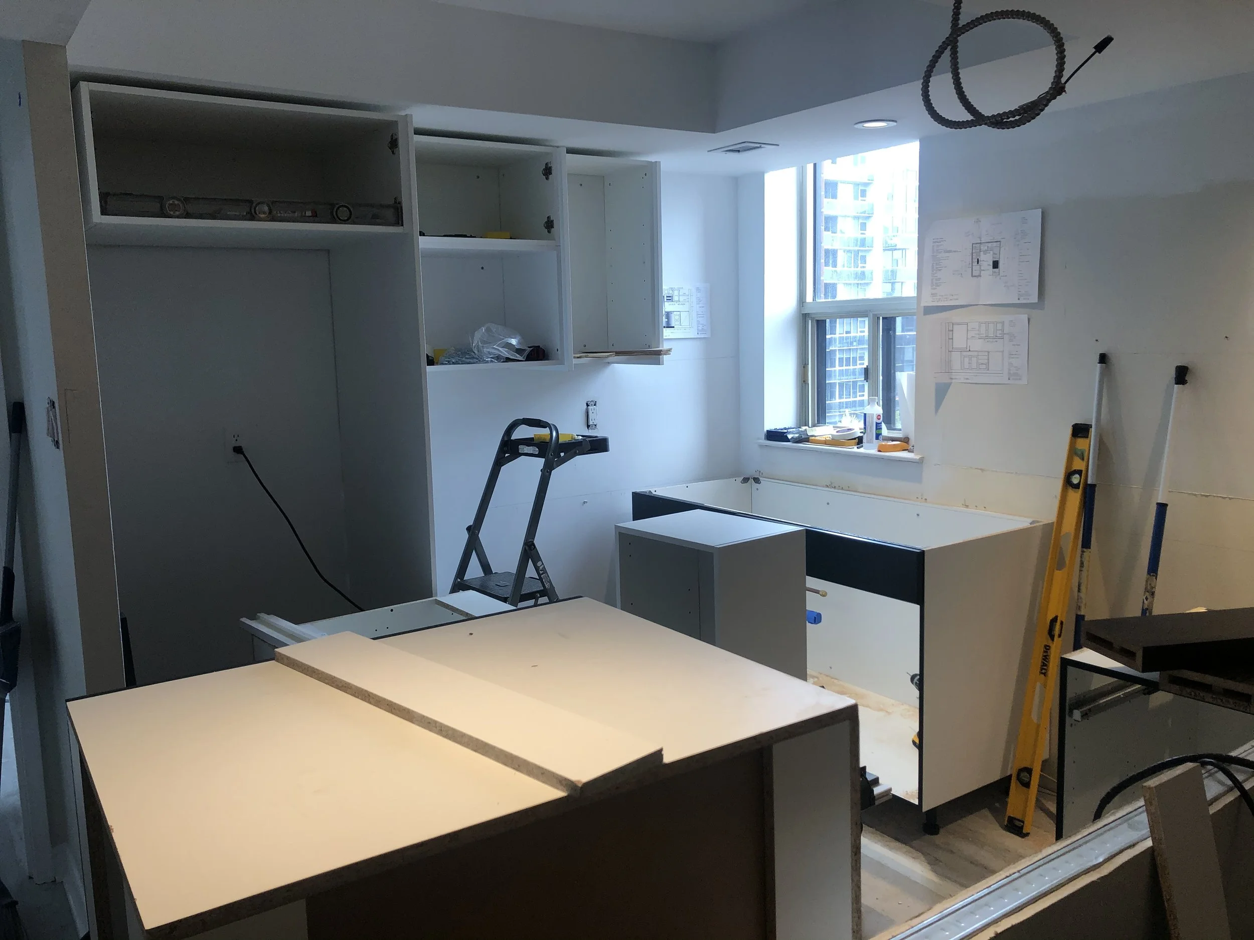
The cabinet crafting and assembly in progress
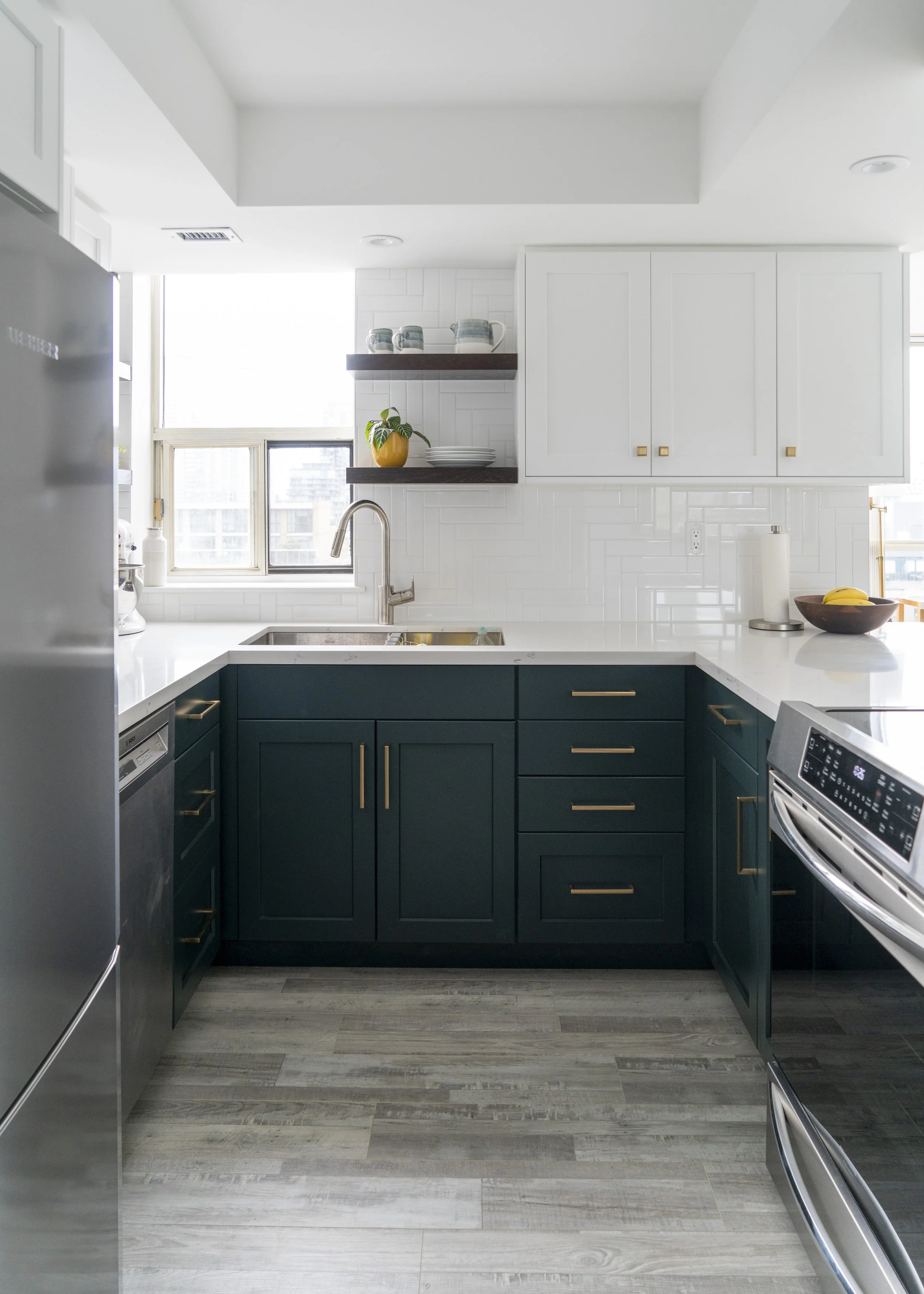
I knew that I wanted to convey the feeling and openness and expansiveness, and so I initially had assumed that I'd be doing all white cabinetry. But ultimately that seemed a little unexciting for my taste---and so after perusing the interwebs for kitchen design photos, I really latched onto the idea of two-tone cabinetry (light uppers, dark lowers). It's a kind of kitchen cabinetry mullet really--light and traditional on top, party on the bottom. AyA Kitchens, who I'd decided to go with for cabinetry, had two dark coloured cabinet options: navy blue and dark green. While the navy blue is definitely a more classic choice, and indeed what frequently cropped up in Pinterest photos, I was really drawn to the green. Something just a little bit different. Indeed, the sales rep confirmed this unusualness, as he didn't think he'd even ever installed green cabinets as of yet. The cabinets were ordered 2 months prior to when kitchen construction began, and by some miracle, actually arrived on schedule, taking about 3 days to install. I selected brushed gold, fairly minimalist hardware, continuing my gold-accented theme throughout my home. I just like how it imbues a bit of warmth and glamour into the space.
Box o' fan
The next major hurdle was the range hood. Because the wall had been removed, it needed to be an island rather than wall-mounted hood. I'd purchased one option that seemed rather elegant, but island hoods tend to be fairly large and actually span the depth of the counter. Because of how low the ceiling was, I worried that I'd be banging my head against a hood that would be coming all the way up to the edge of the counter. Once they were able to take a look at the duct work, they also knew it would be impossible to install (or would hang way too low), as there was basically no space or room to maneuver up there. And so, my contractor had the great idea to just buy a fan and then build a little box for it. This way, it could be smaller in size and not drop down so low. Eventually, it would be clad in the same cabinet facing as the other white kitchen cabinets to help it blend into the space.
With countertops in, starting to look like a real kitchen!
The countertop was next up on the docket. I had initially thought I'd order a Caesarstone countertop, but when comparing it against a full-sized white door sample, I felt it wasn't quite a bright enough white. Ultimately, I decided to go with HanStone Quartz ("Tranquility"), as it had the appropriate brightness but also a really nice subtle grey veining to break things up a bit. Plus, it was great to be able to support a Canadian company! Latitude Countertops came and took painstaking measurements, and about a week later, were back to install everything (in what was a rather pungent process---all the glues and chemicals made for a bit of a light-headed work day for me). I originally hadn't planned to have the countertop extend into the dining room space at all, as I didn't want to intrude too much into that area. But ultimately I knew that people would be congregating around the counter, so it would behoove me to provide a bit of overhang to allow for stools.
One of the final piece(s) of the puzzle (literally! ha) for my contractor was the tile backsplash. I knew I wanted white subway tile but didn't really know about the multitude of different layout options that are possible. I like a herringbone pattern (which is also in the bathroom), and MaryLynne had the great suggestion of turning that pattern on its side. It's funny watching the tile go in, as the lack of grout makes the pattern worryingly bold and busy-looking. But I knew I'd had the same reaction when watching the bathroom floor tile go in, and so assured myself that it would all blend in nicely once the white grout was in (which it did!).
Drum roll please...
a transformed kitchen
The appliances were one of the last pieces to be installed, as it was a bit of an ordeal to obtain them. I replaced my refrigerator with a counterdepth fridge, of which there was really only one option at 30" wide (Liebherr). I wanted an induction range---they heat things up significantly quicker and the stove top wouldn't get too hot, making it safer if people are sitting at the countertop. I had ordered a GE Profile range, but it had become backordered with its delivery date continually pushed out. When I heard that it was delayed again for another 6 weeks, I couldn't wait any longer. The beleaguered salesperson tried to assure me that some people's appliances were being delayed until October, but funnily enough, that didn't really make me feel any better.
I found a Frigidaire Gallery option that appeared to be available (and actually cheaper). It took a bit of finagling, and many somewhat pestering phone calls, but I was finally able to get the appliances installed. Sadly within a couple days of being installed, the range's induction stovetop started throwing errors at me (beeping and burners not turning on)---after a month's anticipation of eating home cooked meals again, I have to admit I just stared at it and cried. Frigidaire eventually sent out a service guy, who was able to fix the issue (some connection problem apparently---oh accursed technology!). But at long last, I am now able to cook.
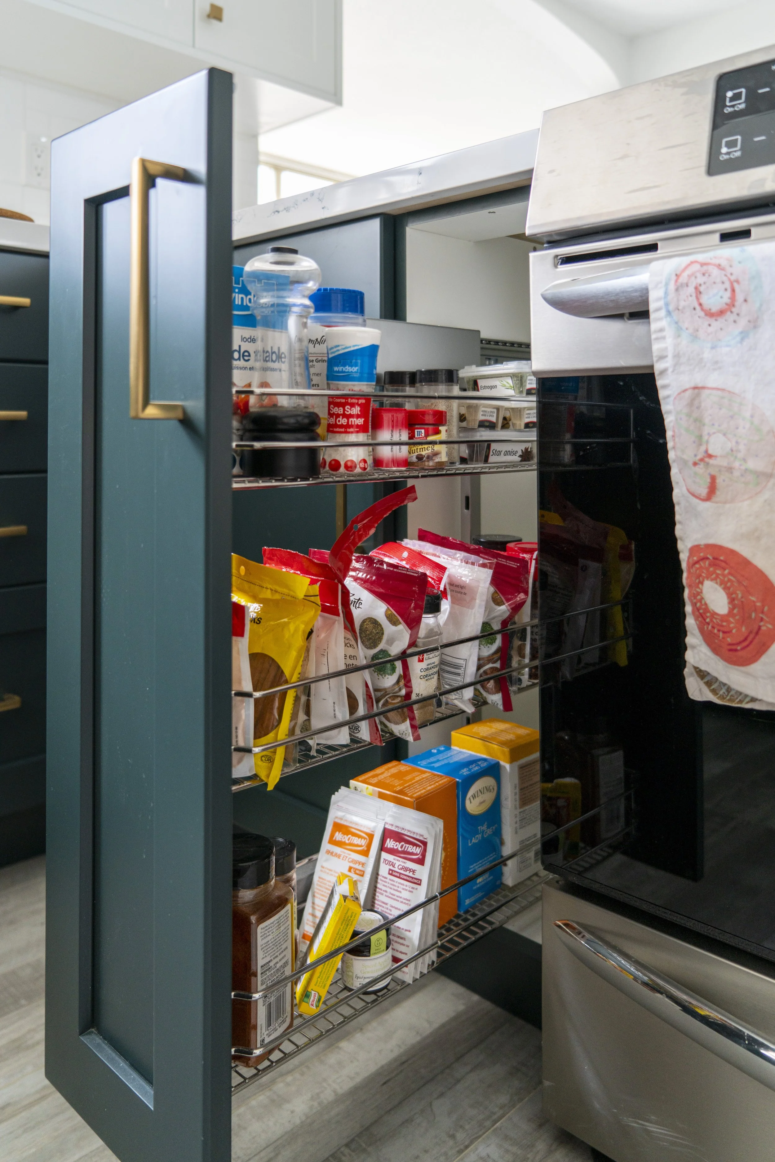
pull-out spice rack FTW
this Lemans pull-out is magical
a splash of gold in the ceiling's light fixture
I loved finally maximizing the storage space, with the inclusion of a Lemans blind corner pull-out and some pull-out racks. These things are life-changing and completely worth the investment to ensure I don't allow food to get forgotten in the back of a cabinet. With relatively minimal cabinet space, I had to be sure to use up every inch of it. It took a bit of consideration when loading all the cabinets, wanting to ensure I was optimizing where things were being put as a function of how I would be cooking the space. And it's something I know I'll continue to re-shuffle and optimize as I spend more time in the kitchen.
The last stumbling block, strangely enough, has been my under-sink garbage. The cabinet guy had installed a 2-bin pull-out, and then the countertop guys came in and installed the sink. All well and dandy. However, when my contractor came in, he realized there wouldn't be enough clearance above the garbage for the sink's plumbing, perhaps because this sink is deeper than average (all a bit annoying because I ordered both my garbage pull-out and sink through the cabinet guys, so in theory, this could've been realized sooner). As of right now, the garbage pull-out is sitting in the sink's blind corner, and I suggested just installing it there. The disadvantage of course is that it won't pull-out of the cabinet but rather across it, but there doesn't seem to be much of a way around it given the dimensions of the under-sink space.
Despite these foibles, I am incredibly grateful for the excellent craftmanship and relative speed of the entire endeavour. In the end, we were basically on schedule for completing the renovations (seemingly unheard of during pandemic, or let's be honest, the best of times). The transformation is truly stunning---it's a completely different, unrecognizable space. And I love it. One of the great features of the condo is that it's not really open plan (which is a kind of layout I've never really been a huge fan of anyway), but it does still convey a sense of openness. It's great to be able to glimpse at different rooms through doorways, like being able to sit on my living room sofa, see past the kitchen and out the windows of the den. I look forward to all the meals and memories I'll create in this new space!
Source List
Cabinets: AyA Kitchens (Pacifica, "Latte" upper cabinets; "Winter Green" lower cabinets); "Walnut" floating shelves
Cabinet hardware: Berenson Hardware
Countertop: HanStone Quartz, "Tranquility"
Light fixture: Design Within Reach
Faucet: Hansgrohe
Range: Frigidaire Gallery
Refrigerator: Leibherr
Flooring: Vinyl Plank
Paint: Benjamin Moore, "Chantilly Lace"


