A Bathroom, Refreshed
When I started looking at condos online, I think I had it in my mind that I wanted my pick to be all shiny and finished when I bought it. Why would I want to take on that kind of work to renovate? However, when I first toured my eventual condo, I was struck not only by what was there but also by what it could be. I loved the bones of the place, a rare and spacious layout, and quickly realized that I'd be willing to take on renovating just to get those bones.
The only two rooms that looked to have not been renovated since the building's inception in the mid 1980s were the bathroom and kitchen (unsurprisingly, as they're the most expensive rooms to renovate). I decided that I wanted to tackle renovating them early on to try to lump together the disruption of moving with the disruption of major renovations. Of course, with the pandemic raging, renovation timelines became somewhat delayed, but at least that gave me lots of time to plan and design.
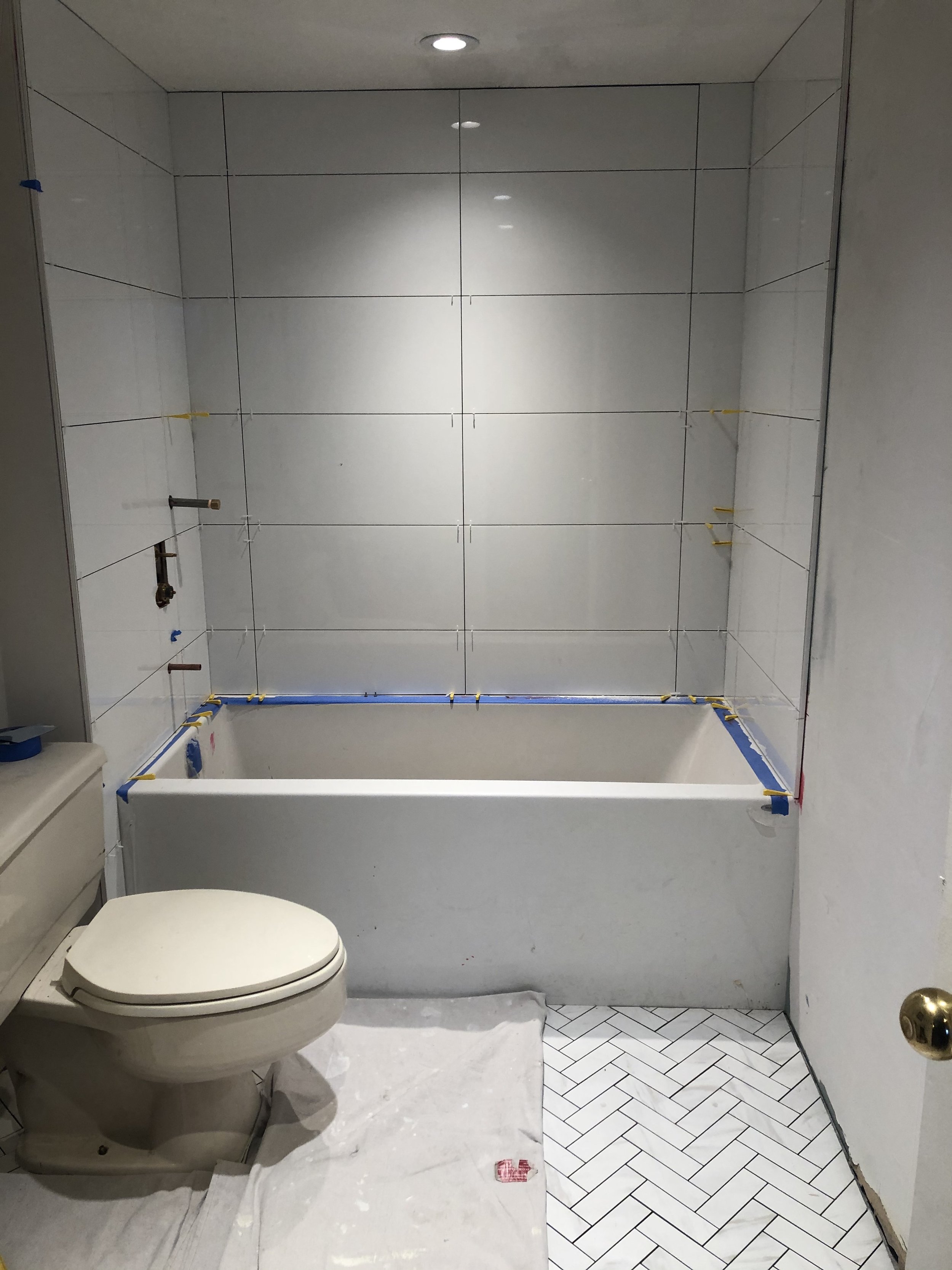
"Before": I love that the residue of my pink hair dye streaking down the wall makes it look like someone had been murdered in here
As a supremely un-handy person, my first challenge was in figuring out who would be doing the renovating. Now I can Google with the best of them, but I was highly leery of just picking a contractor from seemingly good internet reviews (we've all heard the horror stories and seen the reality television series of bad contractors run amok). And so I decided to hire my friend and interior designer extraordinaire MaryLynne Meschino (Allegro Interiors), in order to pick her brain for reputable vendor recommendations but also to get her design input and opinions. I was going to be investing a lot of money into these renovations, so it's always good to have a second opinion and support. She recommended ArmentaLevy Interiors as a general contractor, and I was happy to secure someone who was vouched for and trusted.
Condo renovations kicked off with the bathroom, as kitchen cabinets would take months to come in. One upside of renovations being delayed due to lockdown was that I managed to have all the fixtures, cabinets, and bits and pieces ready to go for when renovations actually began (some in fact were ready a bit too early).
The face that launched the thousands (of dollars) -- i.e. my inspiration image
Similar to my den, it was a single Pinterest image that sparked my imagination--blue vanity and gold fixtures. As in my den, I was eager to inject a bit of bold colour into the different rooms of my home. While the bathroom was being gutted, it was ultimately just being "refaced" essentially. The layout was remaining identical; it was just being given a refresh. The first step for me was finding the right vanity, which would set the stage for all other design decisions. Thankfully, there seemed to be a fairly finite set of blue vanity options in the city of Toronto, and so I was able to decide on it quite quickly (so quickly in fact that it sat boxed up in my dining room for months while we were locked down).
The number of decisions one has to make when renovating is truly remarkable. Never thought I'd need to be researching and deciding on toilets, but there are in fact a multitude of toilet options to choose from. I honestly really didn't care that much about my toilet--I just wanted it to be white and appropriately functional at what it needs to do. The selling point on my ultimate choice, the Kohler Cavata, was that it was WaterSense certified (saving 20% in water) and offered a choice of flush options. I ordered the toilet from Rona, which was available for pick up way sooner than I'd anticipated. I loaded it into the backseat of my car, but since we were still under lockdown, it lived in my car for months. I didn't have a sofa for the first few months in the condo, much to my chagrin, so I half-joked that I should bring up the toilet to use as interim seating.
Once things got underway, it was fascinating to watch the speed of demolition (it's amazing how fast things can get torn apart). Within a couple of days, any vestige of the original bathroom was gone--we really were just down to the bones.
One of the first little speed bumps was determining whether the recessed medicine cabinet I'd purchased would be able to fit. There are building pipes running pretty darn close to where the cabinet would go. And based on the cabinet dimensions listed on the box, we needed to find about 1½" of space otherwise the pipes would get in the way. We discussed possibly contacting the building plumber to try and re-route the pipe, but thankfully, upon measuring the actual cabinet, we discovered the listed dimensions were off by about an 1". We decided that shifting the cabinet off-centre ½" was a small price to pay for being able to actually recess it.
The colour of the drywall would actually be quite lovely as a paint colour
The original bathroom was somewhat dark and dated, with the beige on beige tiles and cabinetry. Since there are no windows in there, and just a single fluorescent light source above the sink, I really wanted to brighten up the space as best I could (when the curtain was closed, I was showering in almost complete darkness). That meant installing lights not only around the sink but also in the shower area (huzzah for no longer trying to shave my legs by feel and a prayer).
The colour of the waterproofing, however, is a rather less appealing wall colour option
One of the challenges of pandemic renovations is that you don't have access to facilities you might normally have access to. Were it any other time, I'd be able to shower and use the toilet in my building's spa or go to a nearby coffee shop. Instead, I was always on toilet watch--wondering when I might lose access (my contractor did his best to return the porcelain throne to its seat after he finished work every day). But there was ultimately one toilet-less night, which I survived by just not eating or drinking anything for the entire evening. Sending a heartfelt shout-out to my dear friends who I was permitted to see (as I live alone) and who provided me access to a weekly shower, otherwise it would've been a reallllly long, fragrant few weeks.
I knew I wanted white wall tile to keep the space nice and bright. In my mind, I had defaulted to it being just regular subway tile, so I really appreciated MaryLynne's suggestion of having larger tiles. It reduced the visual busyness in comparison to the floor tile and critically will result in less grout to clean--an important point for a perennially lazy bathroom cleaner.
Finished floor tile--such pretty shapes and colours
For the floors, I couldn't seem to find the patterned tile from my inspiration photo (or at least not at a reasonable price point). Building off that inspiration, I knew that I wanted some kind of interesting floor pattern. I was loving the Pinterest images I was seeing of herringbone tile patterns--a classic look that I knew would have design longevity. Given the busyness of the pattern, I wanted the tile to be a fairly unobtrusive colour (white or grey) with white grout. We found a white tile with a beautifully subtle marbling of grey throughout from Olympia Tile that was just the ticket.
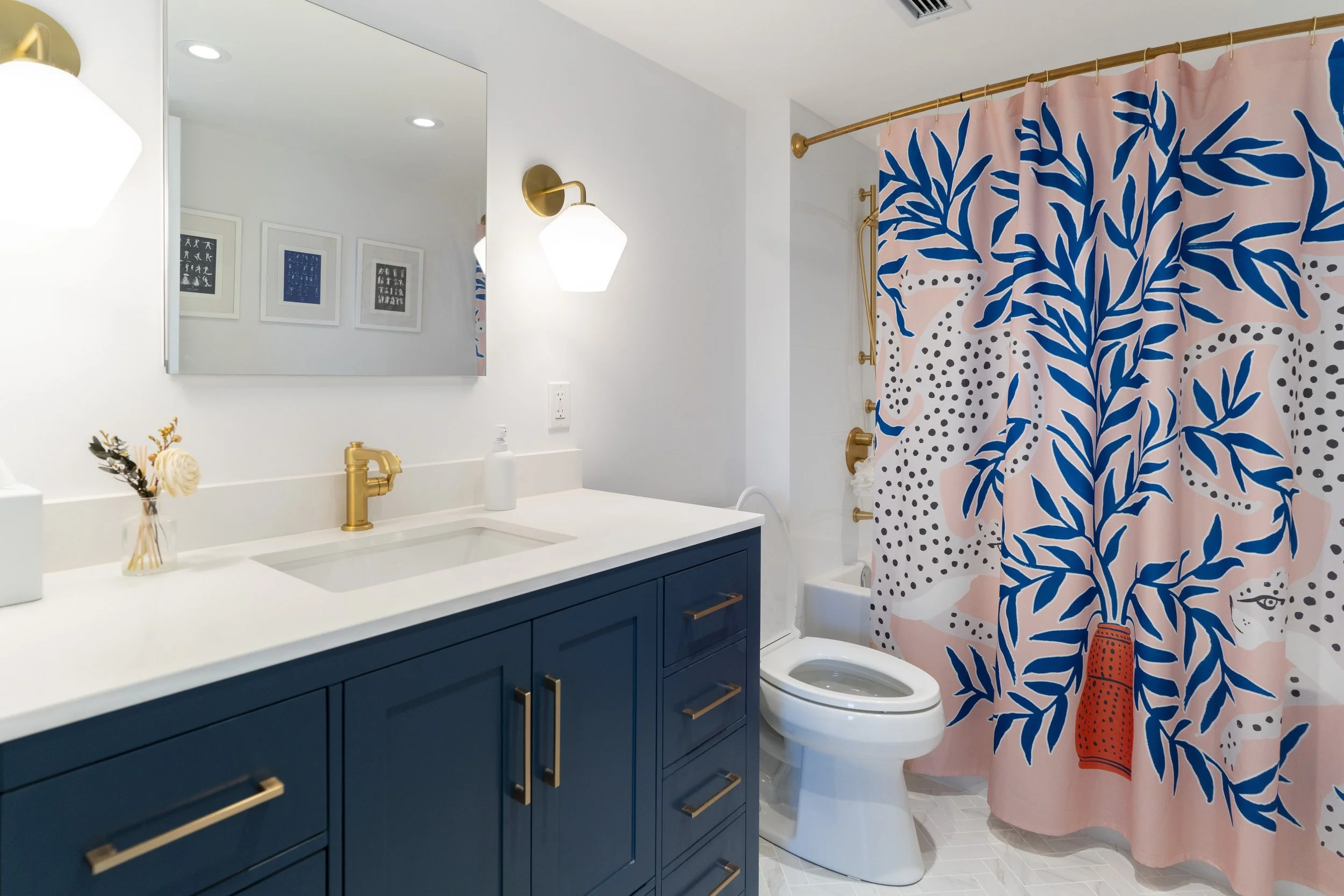
After much grouting and sanding and painting and installing of various fixtures, I had a completely transformed bathroom!
I had initially been worried about the West Elm sconces I'd picked out, as they looked quite large when I opened up the boxes. But there's something to be said for waiting and seeing it all in context (before panicking and returning things) because once they went up, I loved their proportions in the space!
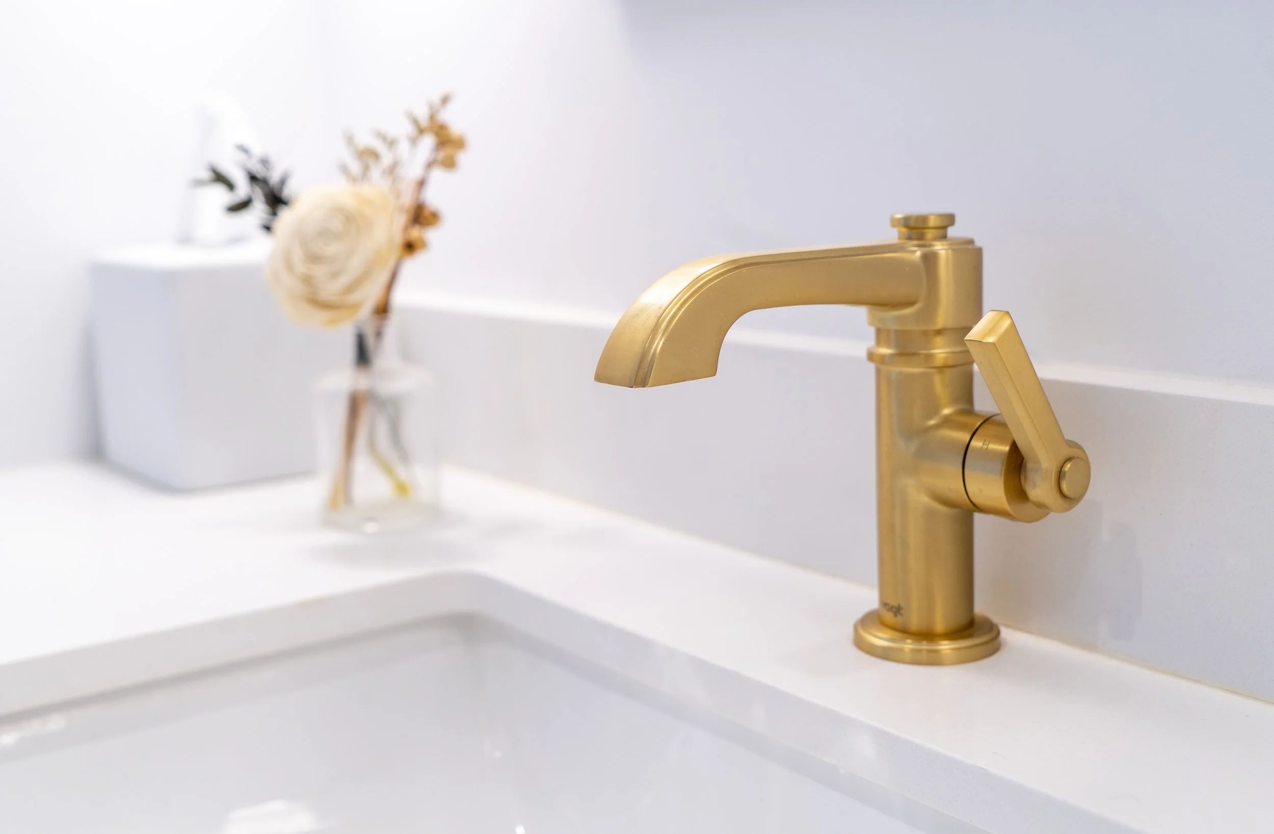
Gold fixtures turned out to be a bit interesting to track down (as they are obviously less common than brushed silver or chrome). The original fixtures we'd ordered actually became delayed/backordered due to issues with the gold finish, so I ended up going with this (more expensive) fixture set from Vogt. I do love the detail and craftsmanship, and they stand out beautifully against the crisp white tile.
The plumbers ran into one hiccup when installing the tub spout. They couldn't figure out why it wouldn't connect properly--thought it might have been missing a piece or perhaps defective. After some back and forth with the supplier, we realized they'd actually sent us the wrong spout (in fact, a wall-mounted lavatory). Because all of the tile and everything had already gone in, it took a bit of creative drilling from the other side of the wall (in my storage closet), but they managed to successfully install the correcttub spout. Mercifully, the shower fixtures were working during all this back and forth, so I was able to finally shower!
Anyone who knows me knows that I'm a fan of whimsy and eclectic decor. To undercut the formality of the space, with its clean, modern design and gold accents, I couldn't help but put up some of my favourite pieces of art (3 prints of classic dance moves) and an animal-printed shower curtain (I'm a sucker for anything with animals on it!). They inject a nice bit of playfulness and colour into the space to keep it from taking itself too seriously--as bathrooms are wont to do.
I was pleasantly surprised at the efficiency of the work (about 3 weeks from start to finish) and thrilled at the quality. While there was nothing really functionally wrong with the original bathroom, it is amazing how much we are affected by the aesthetics of our surroundings--I feel such joy every time I enter this refreshed bathroom space, and I'm sure I'll continue to for years to come.
Source List
Sconces: West Elm
Vanity: Tanya’s
Mirror: Toronto Vanity
Tub/Shower/sink fixtures: Vogt from Taps
Toilet: Kohler from Rona
Shower curtain: Society6
Curtain rod: Moen from Wayfair
Toilet paper holder/Towel bar: Moen from Wayfair
Floor Tiles: Eterna Series ("Volka White") from Olympia Tile
Tissue box cover/Soap dispenser: CB2
Art: Society 6
Paint: Benjamin Moore "White Diamond" (walls), "Chantilly Lace" (ceiling)


